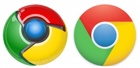

The blue circle in the middle was executed in gradient shades, and its matte texture resembled a globe. The logo became flat, yet still had light shadows, creating a sense of rotation. The icon was simplified in 2011, and now the three-dimensional effect and glossy surfaces were gone.

The three segments featured red, yellow, and green color, which in combination with blue made the color palette, reflecting its affiliation with the Google Company and showing the endless possibilities of the browser to its users. Each of the segments had its sides cut diagonally, which created a sense of swirling and moving, adding a sense of speed and dynamics.

The emblem, adopted by the browser in 2008, boasted a three-dimensional rounded figure, composed of three equal segments and a blue sphere in the middle.


 0 kommentar(er)
